Sherrington Honey Visual Identity
Brief: Over a decade of experience behind this brand and a gorgeous origin story of humble roots - what started with two wee hives being gifted to a grandson grew over time to a deep respect of bees and the glorious honey they make.
The brief was for an identity that felt high quality while still being accessible to kiwi families and something that reflected the love and kindness these guys have for their bees.
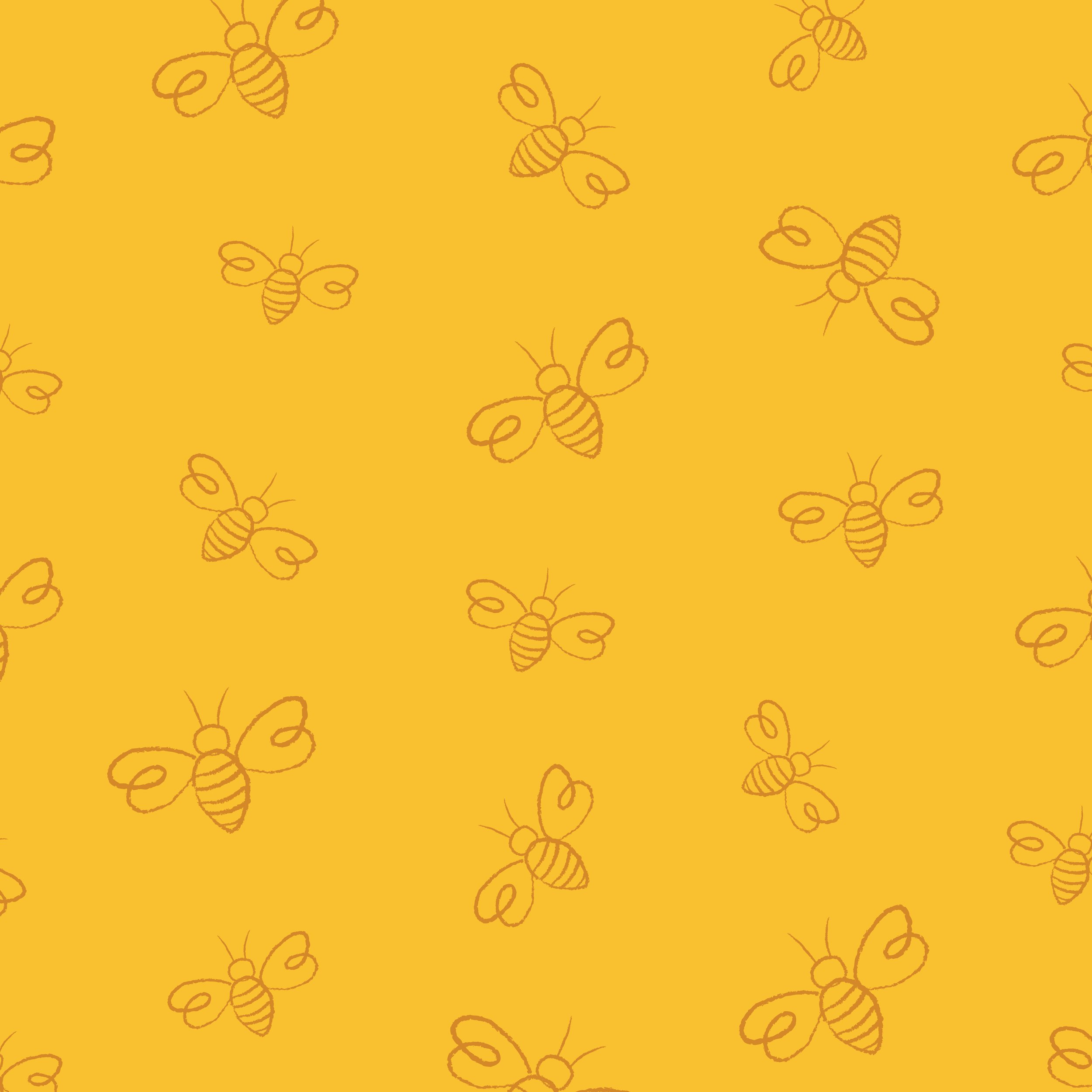
To keep it friendly and show off that hands-on approach, the identity uses hand drawn custom type (always a fav for me), with specially crafted illustrative elements and a colour palette picked right out of the beautiful Marlborough Sounds - where the hives reside. The ‘perfectly imperfect’ look is all about showing the real humans behind the brand and the genuine care they have for their product.


