Frank’s Oyster Bar & Eatery Visual Identity
Brief: Sam had a super clear vision of what he was after which is always helpful as a designer. His brief was for something that felt modern and relevant but still accessible to the everyday human looking to dine out. The logo needed to feel approachable but professional so you knew that the team in the kitchen were serious about delicious fresh food.
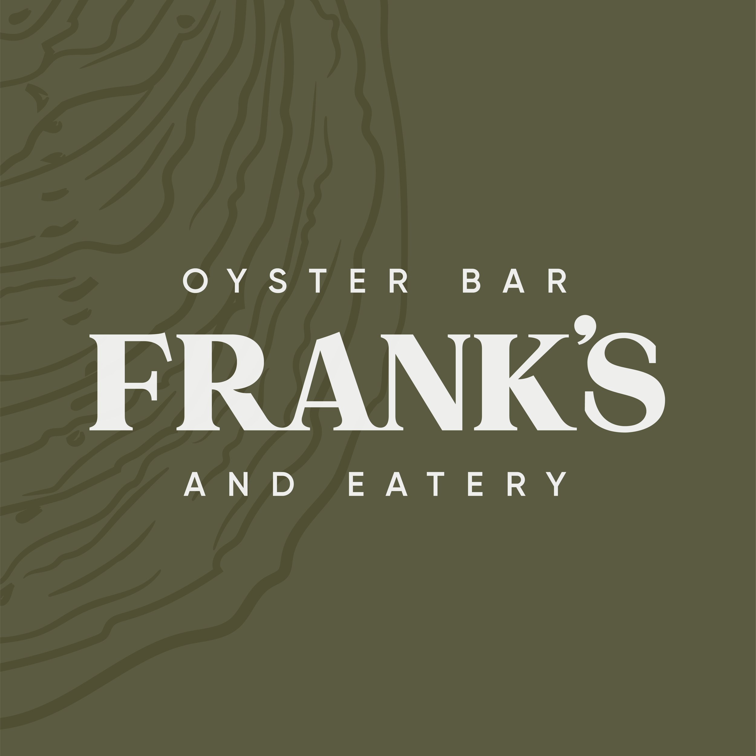
We created custom type for the logo, paired it with some earthy off-beat colours taken from an oyster shell as well as a stylised line illustration. It needed to be clear that Frank’s wasn’t JUST an oyster bar so the beautiful thing about the illustration is it looks topographical when blown up - which links in nicely with there devotion to using local producers.
2022
Full Visual Identity
“We first engaged Caitlyn when we decided to open our first venue. She created an incredible visual identity for our brand, working closely with us to ensure our vision was put from ideas to paper. She created all the associated collateral and was always exceptional with communication and so great with being able to get things done in a prompt manner.
Since then she has created visual identities for two more venues for us, along with all the associated collateral.
I couldn’t recommend Caitlyn enough and look forward to creating many more concepts with her in the future!”
Sam @ Franks, Sammies & Number11