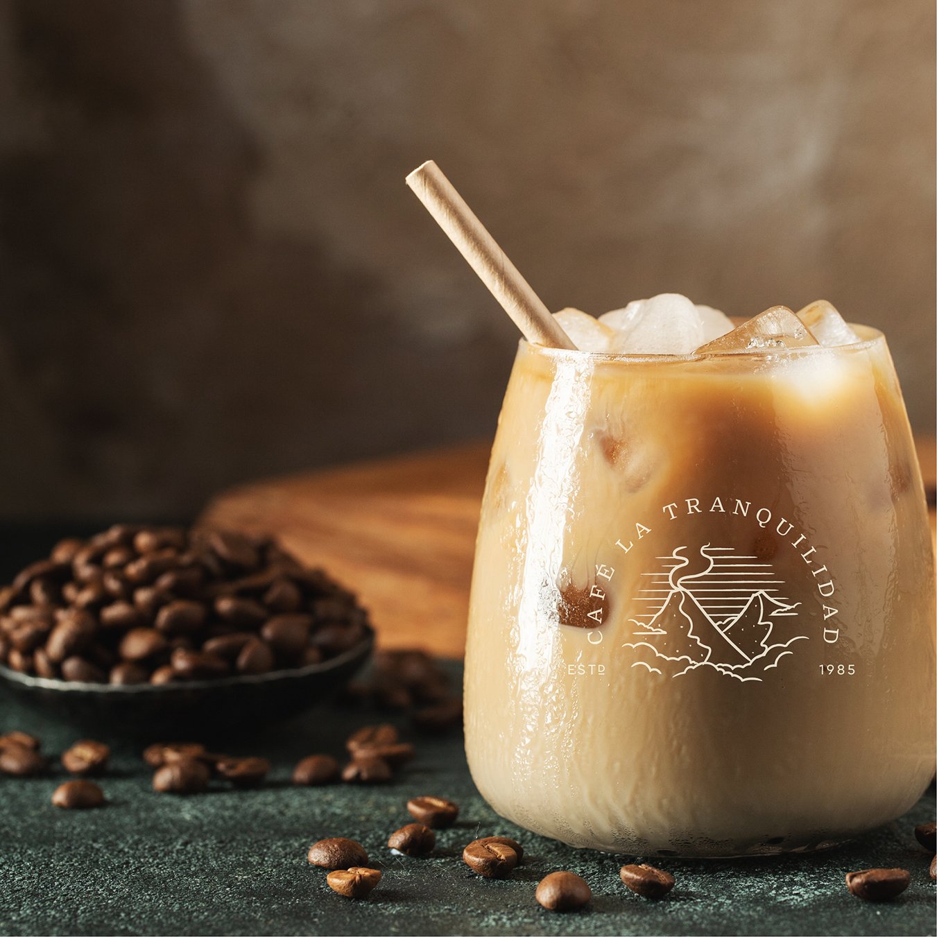
Cafe La Tranquilidad
Logo
Brief: A longstanding family brand that just needed a gentle refresh to help make it more useable and reflect where the product was heading. Loved learning about all the incredible nuances of these coffee beans and the story of the land they’re grown in. Nothing short of magical!
The identity refresh needed to honour the original logo, hero the volcano that is the wonder of the region, while elevating the type and colour palette and keeping things consistent. This concept pushes the illustration a little further to really embrace the magic and whimsy and makes for a super easy badge lock up. Font has just enough rough edges to feel human and the colours are taken directly from the surrounding environment.


